
How I Use My Procreate Brushes for Texture
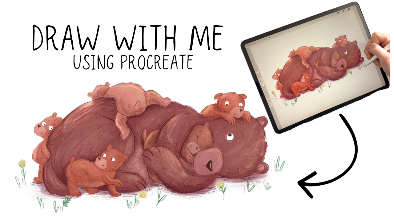
In this post, I'm taking you behind the scenes of a real illustration I created recently that I illustrated to celebrate Mother’s Day of a cosy bear family. I'll walk you through every single brush I used, why I chose it, and how it contributes to the finished piece.
All of the brushes I mention in this post are ones I designed myself. They're available to download from my website shop. I'll link to them throughout so you can grab the exact ones as we go.
Watch the Full Illustration Process
You can watch the full speed illustration on my YouTube channel. Seeing the brushes in use is handy, especially if you’re still learning how to add lots of yummy texture! You can watch the texture build up in real time and get a feel for how each brush behaves before you try them yourself.
▶ Watch: Illustrating a Bear Family in Procreate Using My Handmade Brushes About This Illustration
The piece I'm working through in this tutorial is a cute bear illustration featuring a mummy bear and her baby cubs. It's exactly the kind of warm, emotive, character-driven scene that I love drawing and the kind of illustration style my brushes were create for.
I started with a pre-drawn outline and built up the colour and texture in layers. Below I'll break down each brush as I introduced it in the process.
The Brushes I Used (And What Makes Each One Special)
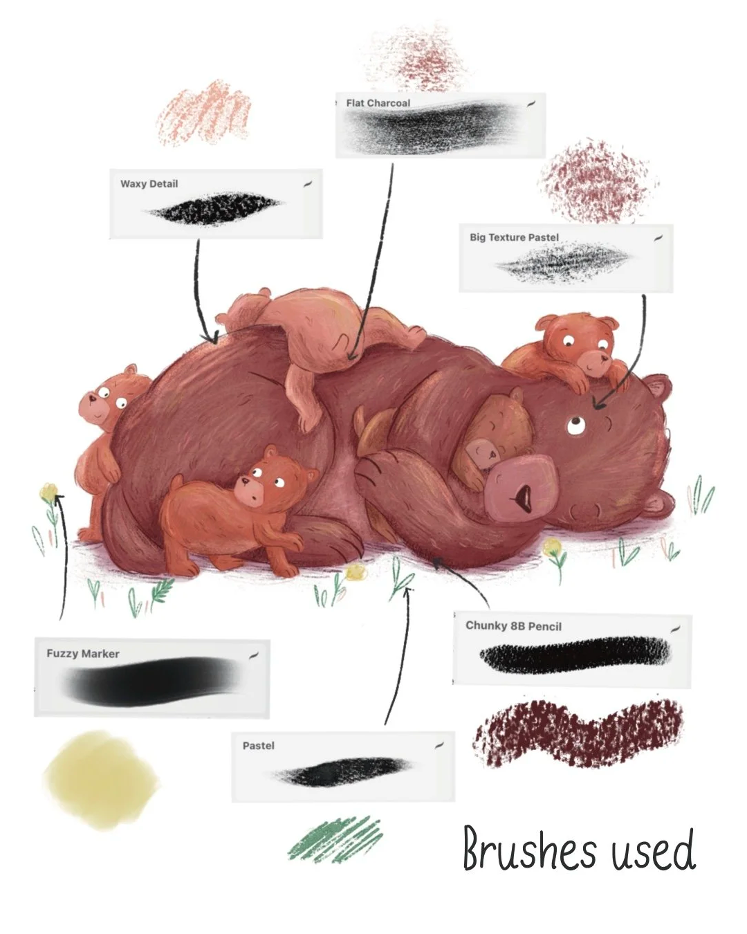
1. Dry Rough Paint Brush — The Block Colour
This is my go-to brush for the very first stage of any illustration: the block colour pass. It's semi-opaque, which means you can build it up gradually to full opacity, or leave it slightly transparent in patches to add interest and depth. I would compare it to a gouache brush. With rough, organic edges that already start to give the illustration a handmade feel!
2. Flat Charcoal — For Shading
Once the base colour is in, I reach for the Flat Charcoal brush to start introducing some shading. This brush is designed to mimic a piece of flat, square charcoal dragged across a canvas. It has a wonderfully gritty, slightly rough quality that adds dimension.
3. Big Texture Pastel Brush — Large Area Texture
This is a large brush specifically designed for covering big areas with loads of texture in one pass. I like to use it with a slightly different colour to the base layer, not lighter or darker necessarily, but a different hue, to create subtle colour variation that makes the illustration feel interesting.
4. Pastel Brush — Line Work and Detail Shading
One of my absolute favourites. The Pastel Brush looks like an oil pastel on screen, and it's pressure sensitive, which means you get a huge range out of it depending on how hard you press with your Apple Pencil. Press lightly for a soft, faint line; press firmly for a harsh, contrasting mark.
I use this one for outlining characters, adding texture to shaded areas, and for the small foreground details like flowers and grass. The pressure sensitivity makes it incredibly versatile.
5. Soft Pencil Brush — Fine Detail and Fur Texture
If I had to pick one brush I use the most across an entire illustration, it might be this one. The Soft Pencil Brush is my workhorse for fine detail work — the eyes, noses, eyebrows, and especially fur texture.
For fur, I use overlapping strokes in slightly different shades of orange, brown, and yellow to build up that layered, realistic fur look. It behaves like a very soft 8B pencil — gentle and blendable, but with just enough edge definition to handle really tiny detail work.
6. Waxy Detail Brush — Oil Pastel Depth
Think of the Waxy Detail brush as the sibling of the Pastel Brush, similar family, but with a waxier, more pronounced texture. I use it to add even more colour layers and to intensify detail in specific areas.
7. Dusty Speckles Brush — Paint Splatter Magic!
This one is a joy to use. The Dusty Speckles brush adds a paint-splatter quality that breaks up flat areas and adds organic randomness to your texture. Even a single subtle pass with this brush can make an illustration feel richer and more layered.
8. Peppermint Texture Brush — Shading the Details
I used the Peppermint Texture brush during the baby bears section of this illustration for shading. Its great for building up shadow without it feeling heavy or overdone.
9. Fuzzy Marker — Lots of uses for this one!
For the foreground detail such as the flowers and ground occlusal shadow I used the Fuzzy Marker. I like to do shading in a couple of stages with this one: first a pass with a darker colour, then a slightly darker shade again on top for depth.
The Final Details
To finish the illustration, I added a final highlights layer using Procreate Add blend mode. This is one of my favourite techniques for making an illustration pop, instead of painting highlights in white or a light colour on a normal layer, using the Add blend mode makes the highlights luminous. I then reduce the opacity to around 20%. For this pass I used a mixture of the Waxy Detail brush and the Pastel Texture brush.
Every brush mentioned in this post is one I designed myself and use in every single illustration I create professionally. They are available to download from my website shop. They’re great if you're a complete beginner looking for your first quality brush pack, or an experienced illustrator wanting to add something new to your toolkit.
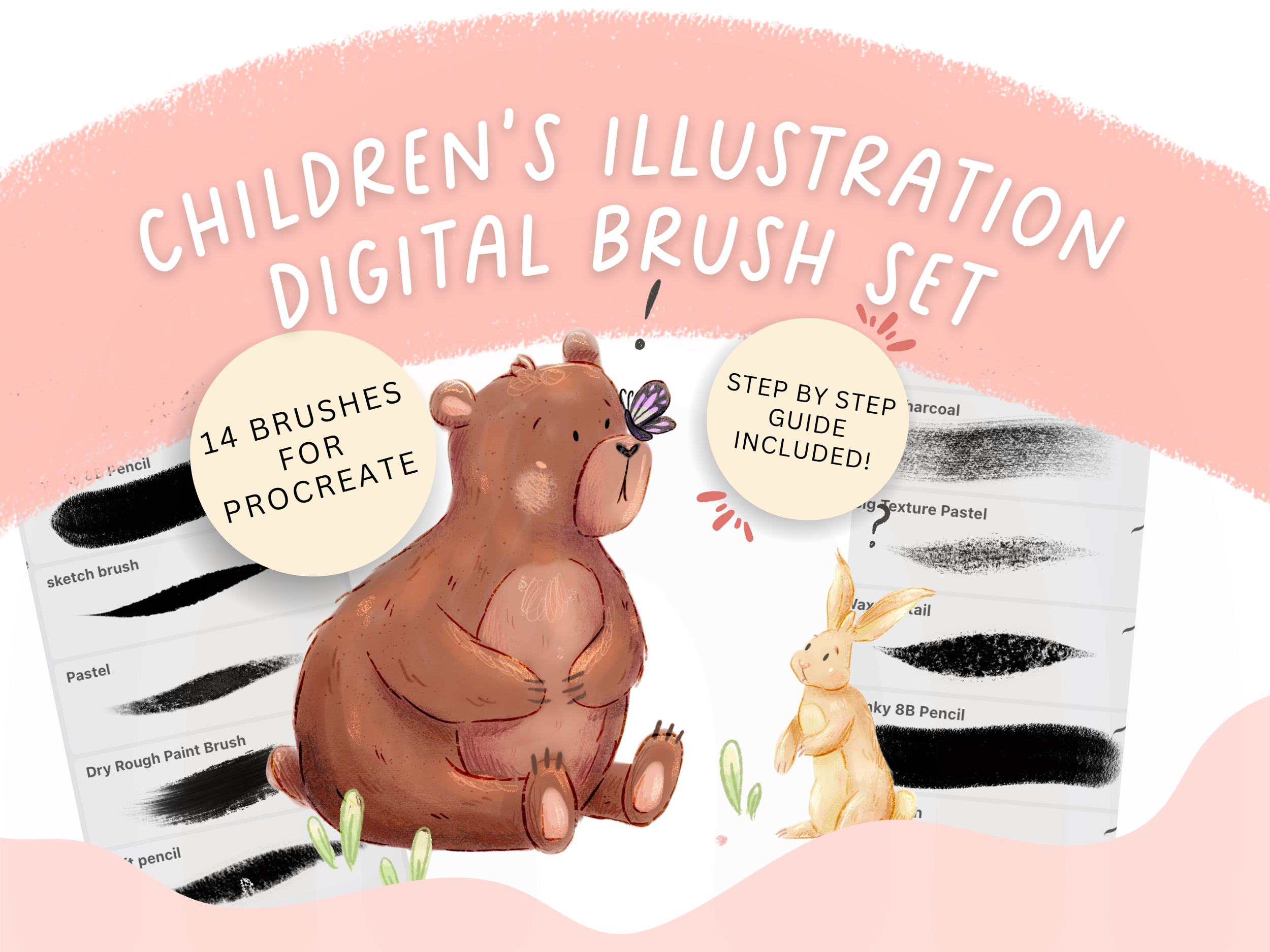
Here's what you get:
• All brushes used in this tutorial in one downloadable pack
• 5 Bonus colour palettes
• A How-to-draw PDF guide showing you how I use the brushes.
• A link to a YouTube video with my drawing process
• Designed specifically for children's book illustration and character work
• Compatible with Procreate on iPad
• Instant digital download — start using them today
If you'd like to see all of these brushes in action from start to finish, head over to my YouTube channel and watch the full illustration video. I walk through the entire process from outline to finished piece, calling out each brush as I use it so you can follow along.
▶ Watch the video here — and don't forget to subscribe for more illustration tutorials!
Happy illustrating! 🐻
Jasmine x