How to create a children’s picturebook portfolio piece (My process as a picturebook illustrator)
Part of my goals for this heart is to continuously work on my portfolio, I often get bogged down with work and I go through periods where I don’t create anything new for months!
I find working on a portfolio piece so fun to do and it can be real chance to push yourself creativity. Today I will be showing you through my process of working on this children’s illustration portfolio piece.
Portfolio pieces matter because they are essentially providing a client with an example of what you can provide them if they were to commission you. Most illustrators get stuck or overthink this process, I can feel a bit overwhelming, but the most important thing is to create art that you enjoy creating, because if you are commissioned on the back of a dog illustration (for example) and you don’t like drawing dogs, well you are not going to have fun drawing a picture book about dogs for the next 12 months!
Art directors look for certain things in an illustration portfolio. They want to know what you can draw really well, they want character interaction, they want storytelling illustrations and they want to know that you can do this over and over again. I’ve been told by a few art directors that one strong piece of artwork is better than 10 weak pieces and that you are often judged on your weakest piece.
So how do you choose a portfolio piece for children’s picturebooks? I think that the most important thing (and I mentioned this previously) is to draw what you love, but also to draw whats in demand by picturebook illustrators. What I mean by this is that your work needs to be marketable, if you have a style that isn’t ’trendy’ or not suitable for children, it will be hard to persuade art directors to commission you. Your portfolio should show a range of emotions from your characters. It needs to tell a story all in one image. I find that scenes with lots of little details work really well. Don’t just design the look of a character, design their whole world! Imagine their likes and dislikes, their wardrobe etc.
My step by step process for working on a portfolio piece;
Sketches - choosing a composition
Composition is the placement of people/animal and objects within a scene that work together to tell a story. A composition will change depending on the emotion of a scene, if it’s a scary scene, your character might appear tiny on the page to evoke feelings of vulnerability. Likewise if it’s a happy scene, you might want to utilise the rule of thirds to make the scene feel balanced and peaceful.
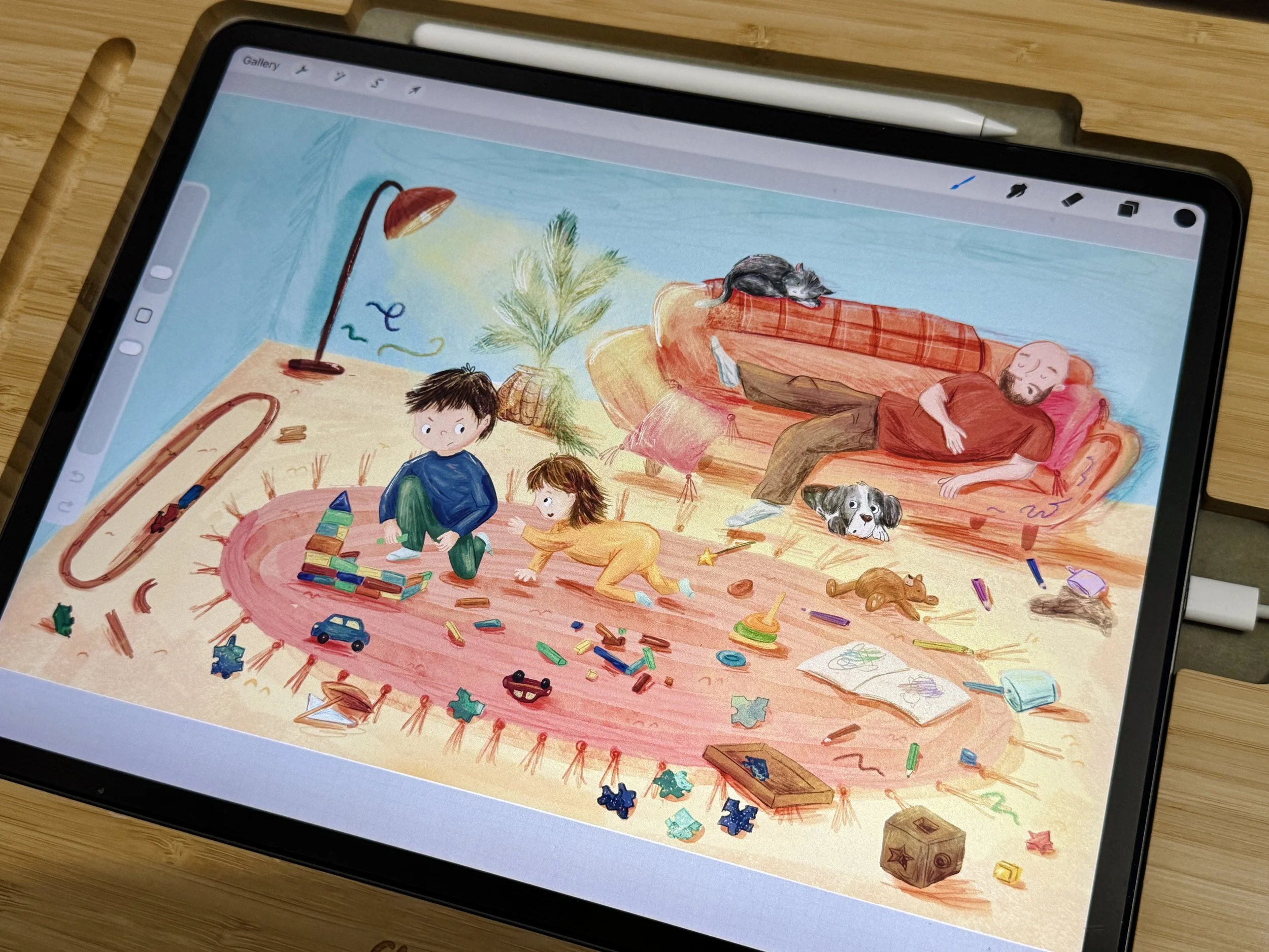
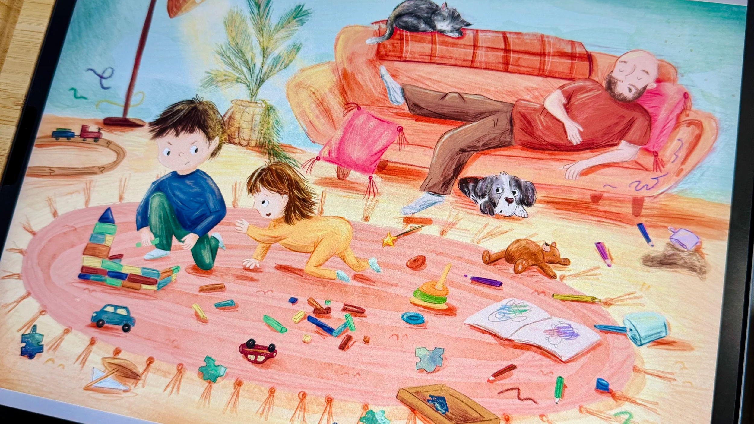
For my illustration I was inspired by my own kids and their playtime. I needed to add a few more artworks to my portfolio that showed human characters, especially children. To show some character interaction, I decided that the little boy was annoyed by his baby sister trying to ruin his block tower.
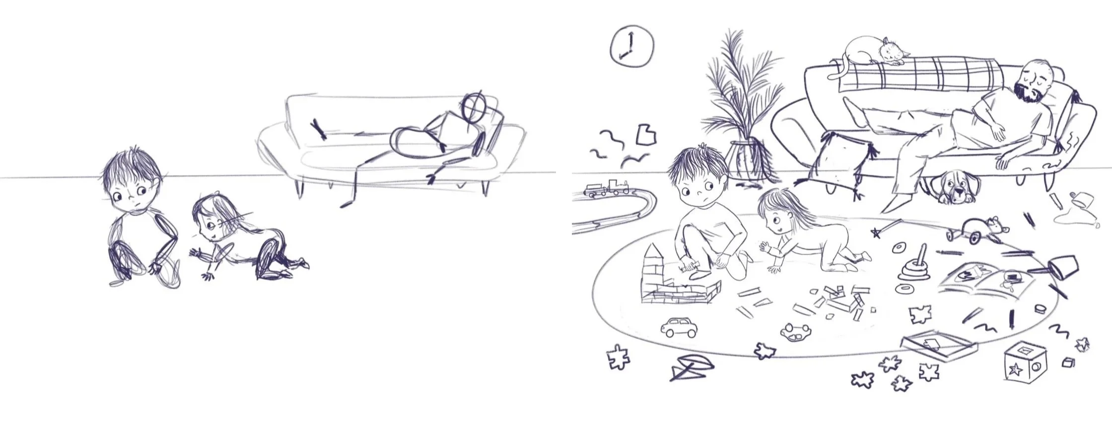
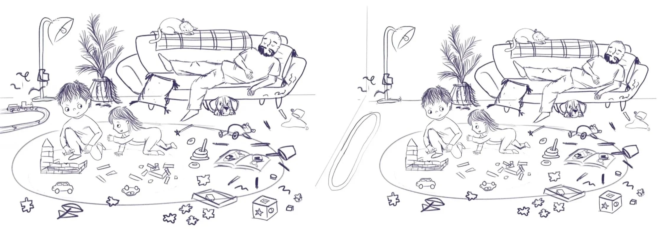
I began with a simple composition, with the back wall dividing the page into 1/3 and 2/3. After getting some feedback from my mentor, I changed the layout so you could see two walls as it looked a little more interesting. I also switched up what you could see on the walls. Initially I had a clock here, but I realised I needed a light source, so I switched it up for a standing lamp to add interest later on when I did the lighting.
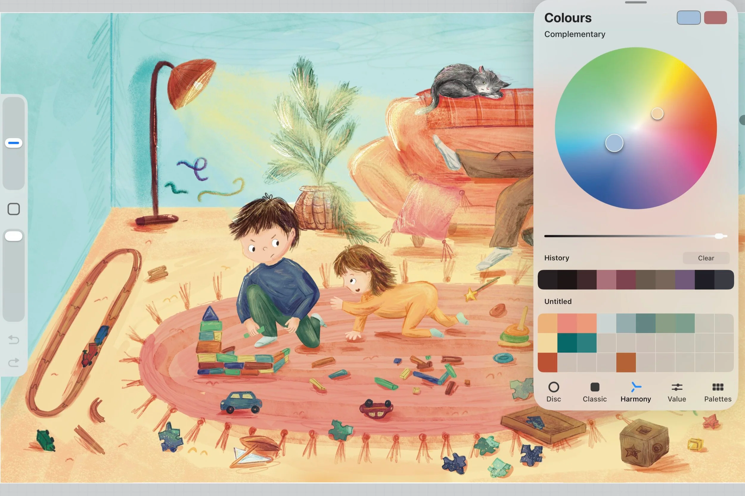
Next was the colour, I needed the characters to stand out against the background as they were the focal point and needed the viewers eye to go straight to them first. I decided on a lightly saturated complimentory colour scheme for the walls and floor, as this shade of blue and yellow are quite calming, in contrast to what’s happening in the scene - chaos! I decided to make the colour blue of the little boys top quite dark as it draws the viewers eye to him using contrast, your eye normally is drawn to the darkest or lightest part on the page.
Next was the rendering, my style replicates real art mediums such as paint and pencil and I love to layer different textures using my Procreate brushes. These are the ones I’ve used a lot for this illustration; at the time of writing this blog post, they arnt quite ready for sale, but be sure to join my mailing list or follow me on instagram if you’d like to know when they are released! I love to create a hand drawn rendered look, so I embrace the imperfections and sometimes the brush strokes are a little loose.
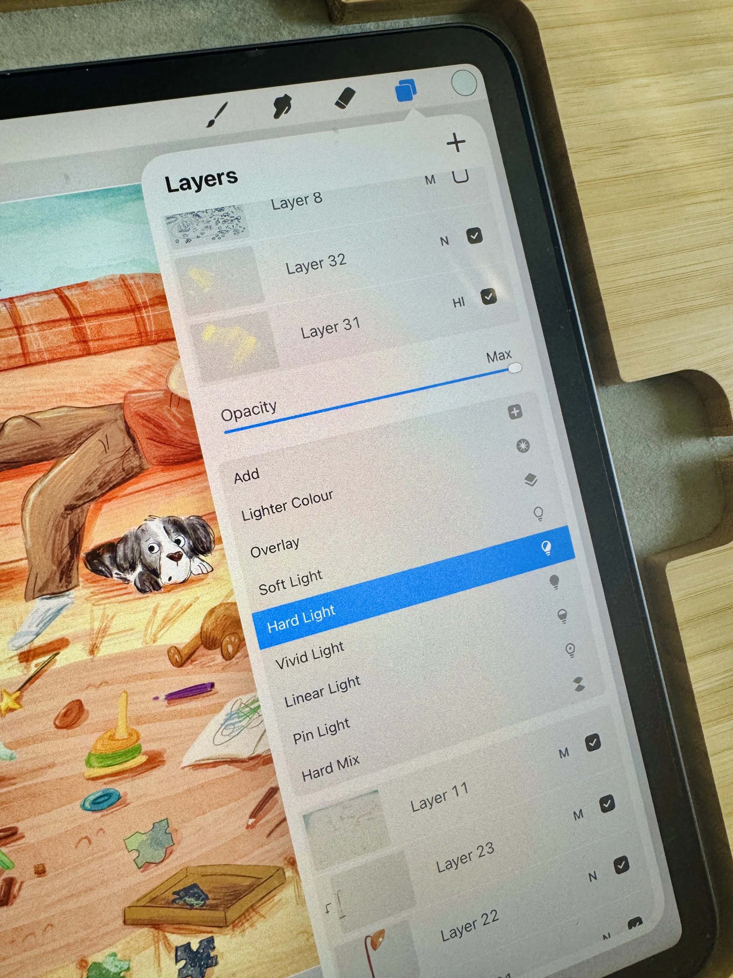
Finally I have the lighting, for this I want wed to show some dramatic edge lighting, so I added a new layer and used a light yellow colour on a hard light blend mode on Procreate.
Common mistakes that I made in my early portfolio pieces are that I didn’t show enough character interaction, not enough storytelling, no strong emotions coming through the characters and also using trend pierces from instagram as part of my portfolio. If you’re interested, I have free guide on simple ways to help make your illustrations better, you can find it here.
Knowing when you’re finished with a piece of artwork is sometimes hard to know! I find that stepping away and looking at it again the next day with fresh eyes helps, often then I spot small mistakes or become inspired to add another element.
And so here is the finished piece! What do you think?